This week I used Claude as my pipeline engineer and data analyst. I had a ton of
fun and figured I'd write about it.
I've been taking a Data Visualization class at Stanford Continuing Studies (TECH
26, Winter 2026). I needed a final project. There's this data set I've always
wanted to play with, TweetsKB. Researchers took the Twitter Firehose data from
2013-23, back when it was more available, and ran it through entity extraction
and sentiment analysis. They made the dataset available for others to work with.
It's well documented and a reasonable size, about 500GB. I figured there'd be
something interesting in there.
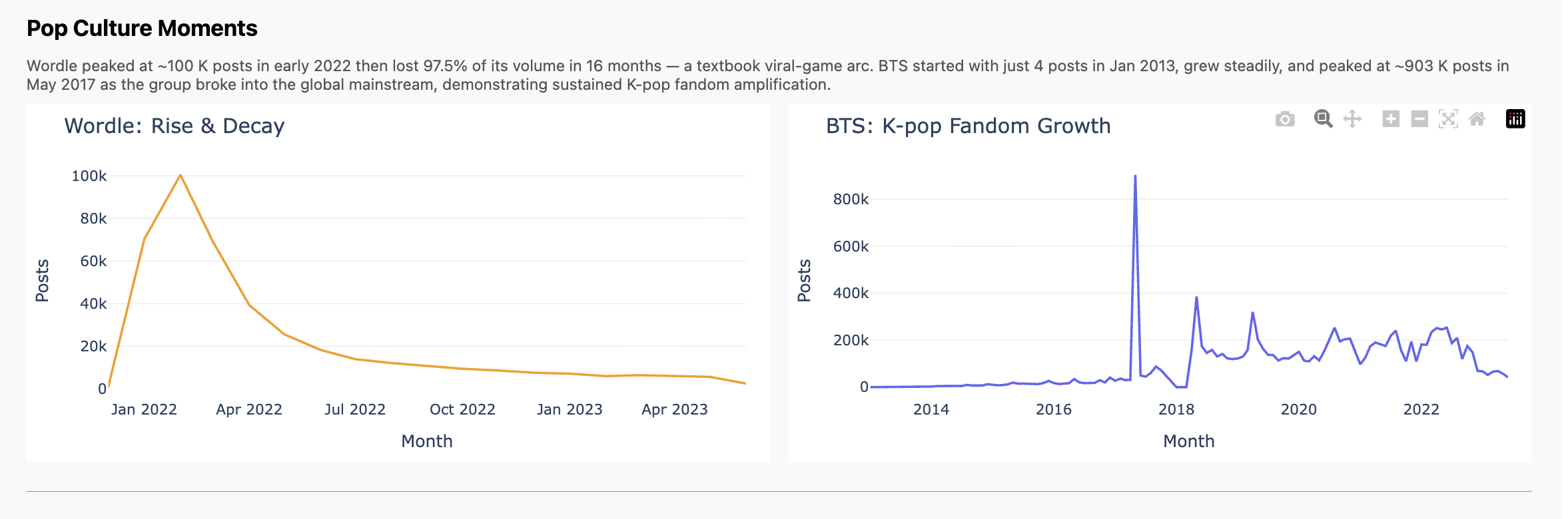
The cool part didn't turn out to be the analysis itself. I did find and graph
some trends, like Wordle hitting the scene in Feb 2022 and then falling off;
contrast that with K-Pop, which we all know has been much more durable. You can
see those in the presentation I did for the class, and I included some charts
below.
But the main thing is this was just plain fun.
What I (We) Did
What I spent the week doing was chatting with Claude interspersed with running
pipelines, bringing up and down jobs, etc. What it felt like though was having
my own junior engineer working hard for me, doing whatever I asked, and doing it
well and without complaint.
This section has more of the details of how it went. Consider skipping if you
don't want to get in the weeds.
We started with ETL pipelines. File format conversion, multiprocessing,
scaling to fit RAM and processor limitations, progress bars and
interruption/restart logic.
Yikes, this is full of offensive stuff! I asked for redaction with
stable terms and it found and used a nice off-the-shelf library.
When I didn't trust what I was seeing, I asked for end-to-end data
quality tests. Claude wrote them and then found and fixed a double counting
bug. Nice!
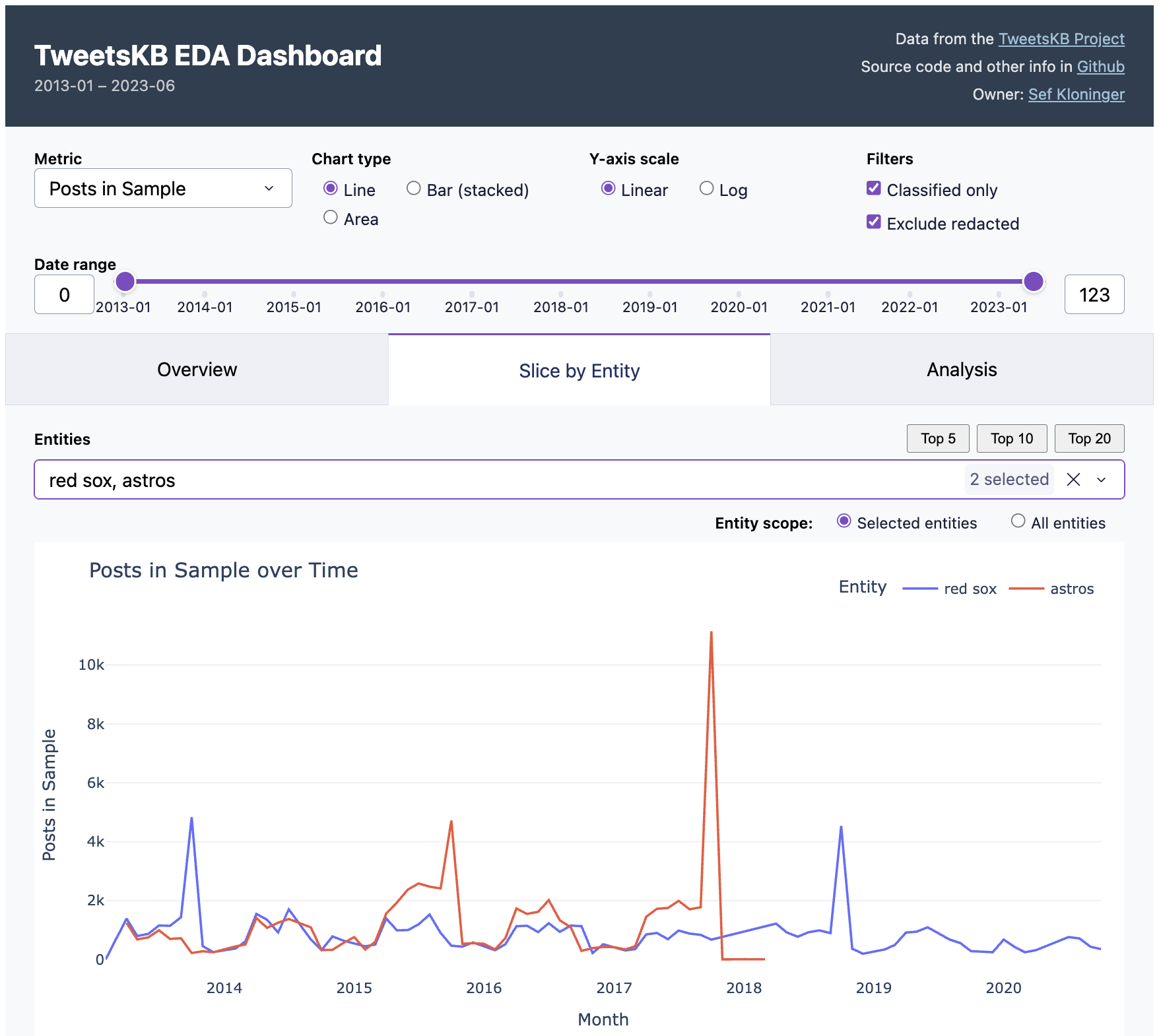
When I wanted to wander around in the data I asked for an EDA
dashboard and got one. EDA is the term of art I learned in class, "exploratory
data analytics". The idea is something where you can click around, slice and
scrub, looking for interesting things like correlations and trends.
You can see this in the screenshot at the top of this post. Essentially I got
the "Overview" and "Slice by Entity" tabs in one shot. How do you do EDA with it?
For example, the default view is two baseball teams. See the peaks when the
Red Sox won championships in 2013 and 2018? But the Astros peak was higher in
2017, presumably because of the scandal. Fun, right?
I then iterated on that dashboard quite a bit. Instead of a normal notebook or
colab-style workflow I was used to, I iterated around the dashboard. I'd
ask Claude to add or update charts in the dashboard ("annualize the last data
point"), it'd reload, test and repeat. I did fall back to python or a notebook
when I had to look at the raw data, but just in throwaway mode. I found this to
be a really fast way to work.
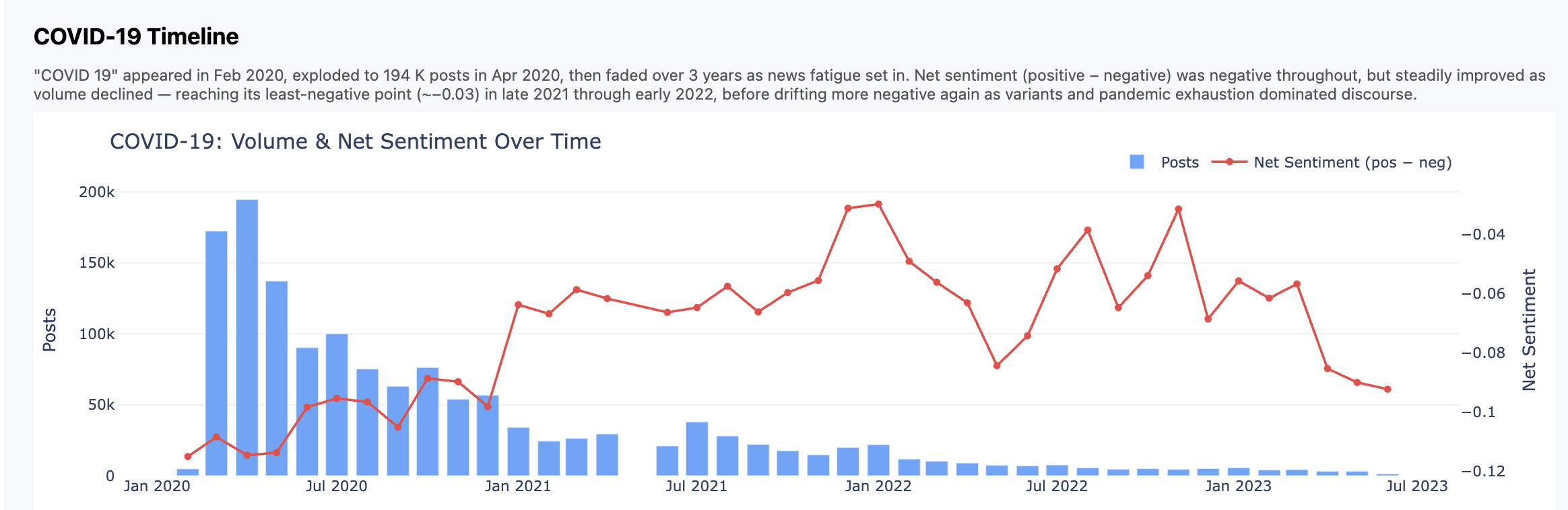
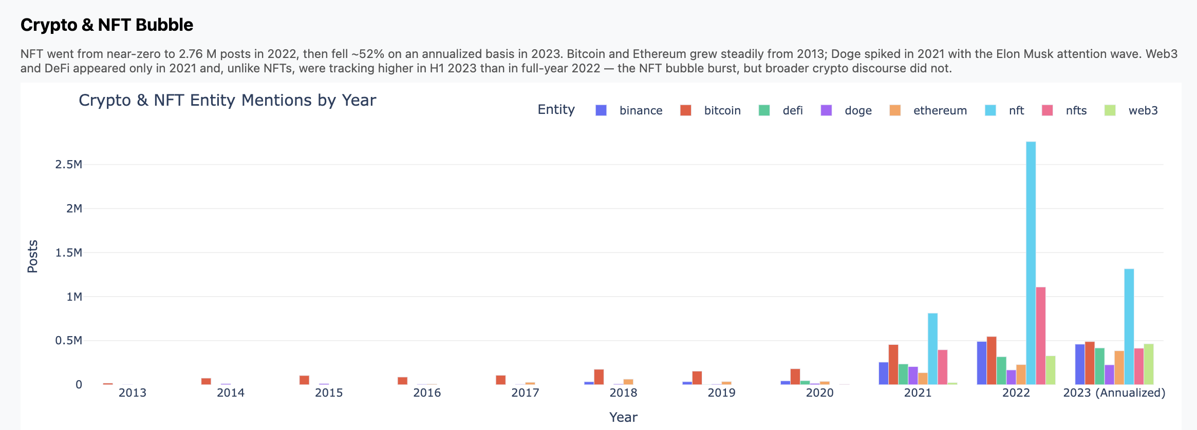
But I still had a hard time finding something interesting in the dataset. So I
just asked an open-ended question, basically "find interesting stuff"
and it produced five analysis scripts. Most of what's in the "Analysis" came
from this one query, except for "Democrats vs. Republicans", which I did on my
own and didn't prove too insightful.
And yes, when I had ops issues Claude fixed those for me too, see screenshot
below. Sure, I could tune workers vs. threads and manage PID files, but who
wants to? And yes, when it came time to write the presentation, Claude wrote
that for me too. Well, most of it.
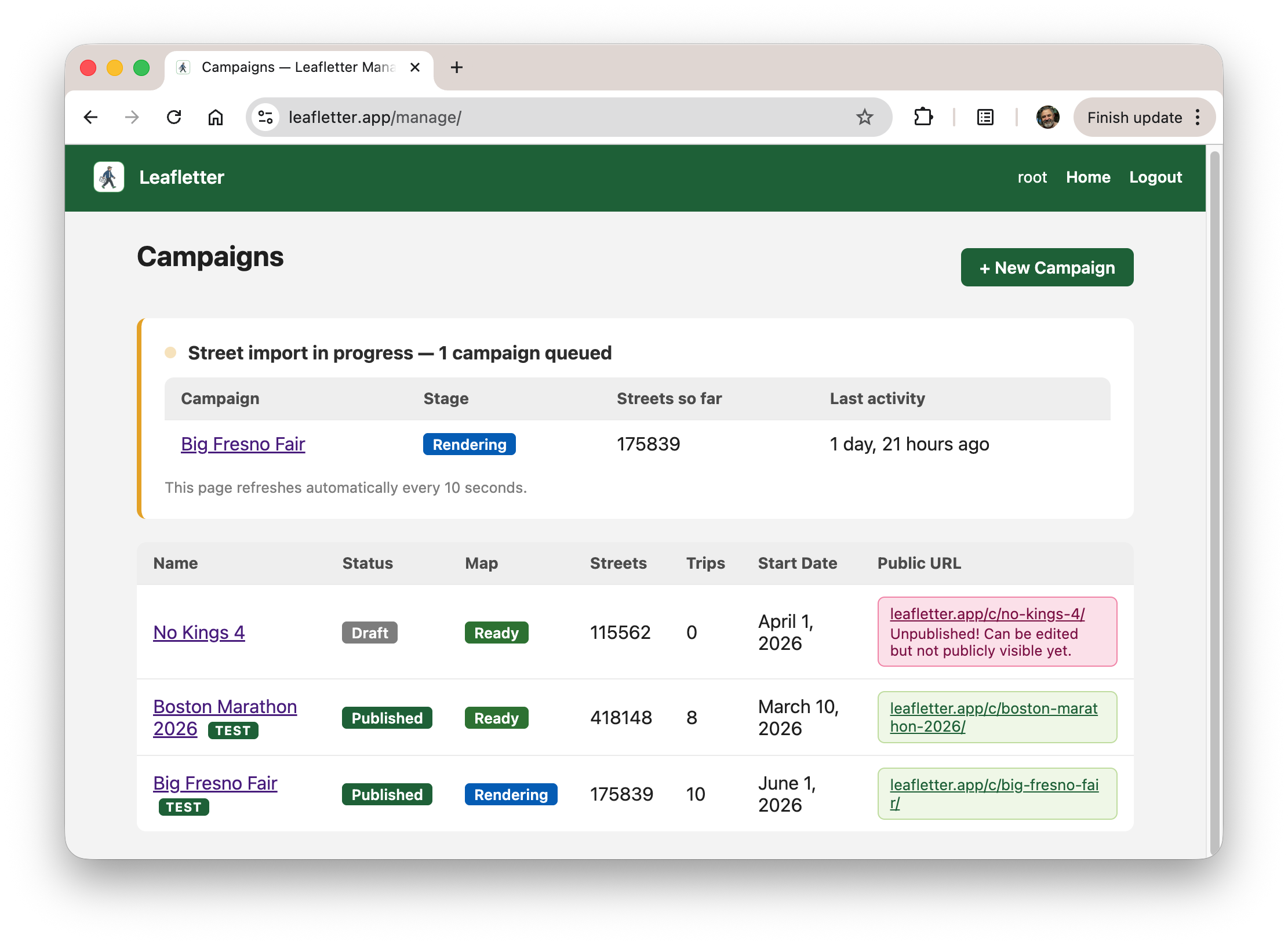
You can play with the dashboard yourself. It's hosted on an underpowered
server at my home, so if it doesn't work, let me know or try again later. All
the code is in GitHub and there are known issues.
At some point I felt it was helpful to define "personas" for Claude to better
describe the goals of each prompt. Then I started a prompt with "hey dashboard
engineer, I'd like to...". Tough to tell how much that helped.
Some Thoughts
Let's not give AI too much credit. Pulling entity mentions out of tweets is
something that data scientists and journalists have been doing for years. And
this particular dataset probably has been around for a while and might very well
have been used and written about, by undergrads. The story here might very well
not be "gee whiz, looks at how smart AI is" and more "look at how AI has scooped
up and repackaged years of everyone else's work."
The speed of accomplishing these dev/debug tasks was remarkable. I felt like I
had a coworker. And at remarkably low cost, too. This was all using the Claude
$20/month plan. This past week was the time I poked above the token cap. I
happily paid $5 more to keep on going.
Is this programming? I think so, at least it felt that way when I was doing it.
I was very much using the same parts of my brain as when I'm writing all the
code myself. Indeed for years most of us have been "programming" mostly via
Google and Stack Overflow. It's like that but fast.
Charts
Here are three charts that fell out. Again, don't focus so much on the insights
but how these came from a high-level, open ended prompt.
Some Screenshots
Maybe some people would like to see what this looked like when I was doing it.
Here's a screenshot during pipeline development. On the left is Claude adding
some logging; the top right is tail -f on a log file, and the bottom right
shows the progress bars churning through the data.
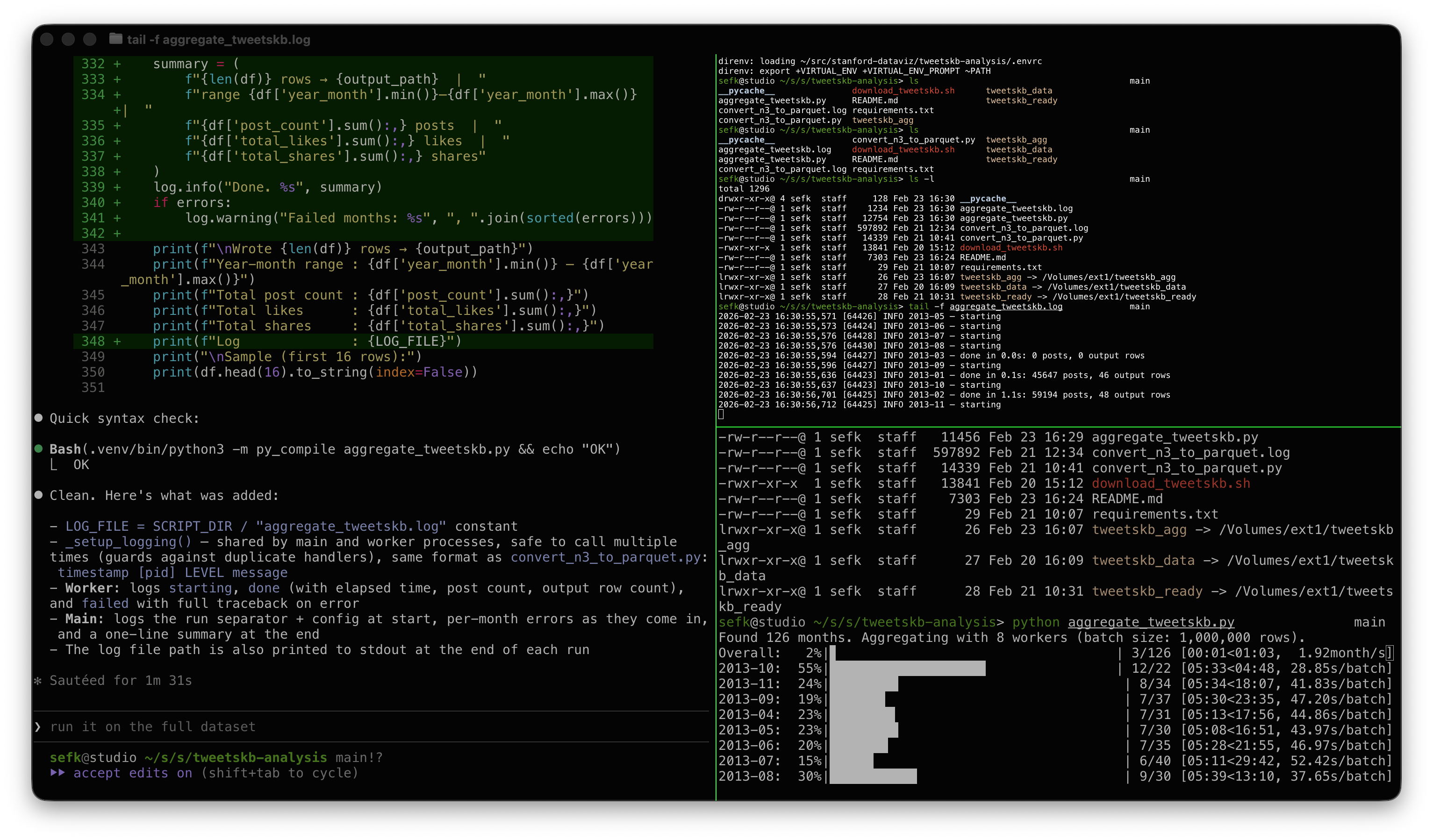
My modest Mac has 8 performance cores, hence 8 workers.
And this screenshot is kind of fun. Look at how Claude explained a worker crash
issue that I asked it to debug: "You already flagged it, the UI literally
says..." 😀
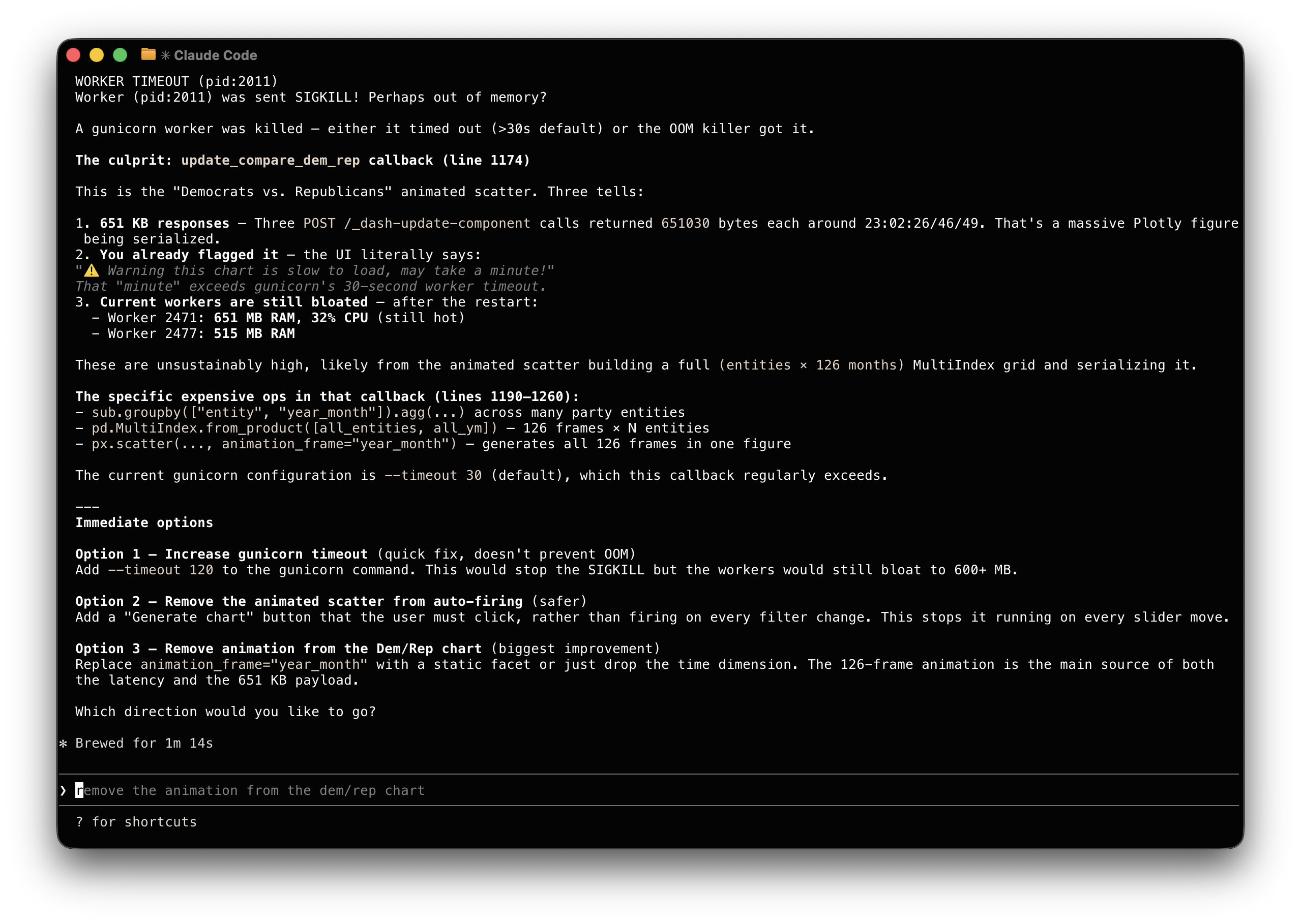
Claude made the adjustment and saved its suggestions in a Github issue in
case I want to revisit it later.


